
Consistent color throughout your marketing materials is key for maintaining a reputable business image. However getting consistent color, and keeping it can be a challenge on it’s own. Whether you’re using a designer or trying to do things on your own, having some understanding about color can help make sense of things and the headaches that often come for those who don’t deal with this every day.
You may have heard of PMS – that’s right…the Pantone Matching System. It’s a huge set of color models that designers use to communicate color whether used in print, or for web-based items. There are so many variations and changes that it’s challenging for seasoned designers to stay on top of it all. However, by maintaining some basic guidelines – we can achieve consistent color. Here’s a few definitions to help you get a better understanding of color and how it’s used.
Spot Color – In offset printing, a spot color or solid color is any color generated by an ink (pure or mixed) that is printed using a single run.
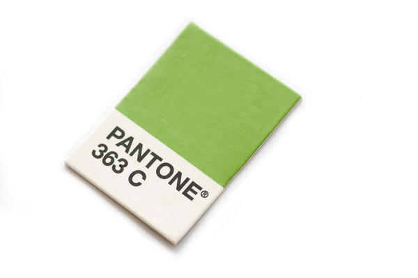
These colors are numbered within the PMS color system to be sure that the correct color is used. You may have heard of a company’s “corporate color is PMS 363”. In the PMS guide, it shows what the color looks like and gives the values of what makes the color.
Process Color – short for four color printing process. A printing process which uses four specific colored inks: cyan, magenta, yellow and black (CMYK), and halftone printing plates, to reproduce a range of colors.